Behind the Scenes: Scenic and Costume Design for Big White Fog

When Theodore Ward wrote Big White Fog, he was very precise in the type of home he wanted the Mason family to inhabit—so much so that he even specified the very cross-streets where the house is located. This same level of care and attention can be found throughout the production directed by Ron OJ Parson, as evidenced in the designs of Scenic Designer Jack Magaw and Costume Designer Yvonne L. Miranda.
Below, Jack and Yvonne shed light on their processes and inspiration, and how they brought this one-hundred-year-old play vibrantly to life. Read on to learn more!
Scenic Design
Jack: The title of the play, Big White Fog, comes from when Theodore Ward was traveling out west. He was looking out at the land, and there’s a quote – I can’t remember it exactly – but he said something along the lines of “I am not a part of this. Even though I live here, I will never have [the American Dream] because I am a Black man.” You know the moment when you learn something, and then a bunch of other stuff clicks into place and starts to make sense? That’s what reading this play did for me.
The first play that Ron and I did together—in his hometown, where he started doing theatre at sixteen, at Studio Arena Theatre—was A Raisin in the Sun. I’ve done six of the ten August Wilson plays, some of them multiple times in different theatres over the last twenty years. All of a sudden, when I read this play, those other plays all made sense to me. That was such a strong realization—the progression from what this play was. Coming into this project, I didn’t know the play because, while it wasn’t actively censored, it was suppressed; but Lorraine Hansberry knew, August Wilson knew, and they continued telling the story. Now, we’re going to go back and tell the original story.
So, let’s talk about the set design. In the very first stage directions, Ward says, “The house is located on this corner—51st and Dearborn—and there’s a window that looks out over the intersection.” Which is where the grandmother, Martha, sits. When I read that, I knew he picked that place for a reason, because Black folks could not own property south of 51st at this time. West of Dearborn was all white Americans and Irish immigrants who worked in the stockyards. To the east, near the lake, was Hyde Park, where rich white folks lived. So, their house was located right on the edge of where Black and white neighborhoods came together, and where the Robert Taylor homes were eventually built in the 1950s .
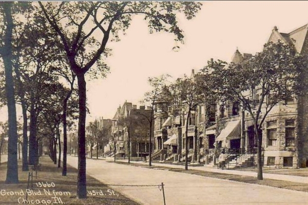
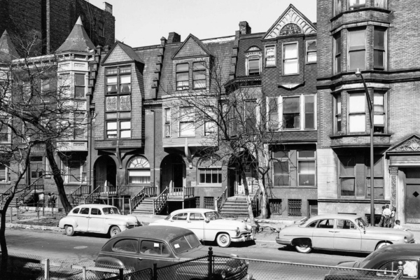
I was trying to figure out what the architecture of the house would’ve been. It wouldn’t have been a giant Victorian, right? It’s not a brownstone. It’s not what’s on the other side of the Dan Ryan, which are small immigrant cottages that were built for employees of the stockyards. I discovered that it was probably a frame house that was two stories; it’s not super special, and it’s old. It was probably built in the 1880s, and by the time we get to the play, it’s probably seen several owners. But it’s not falling down. I read that only 4% of these old frame houses were actually derelict by the time the 1920s came around. They were built really well and lasted a long time, but there was no planning. People were building houses in the backyard to put more people. There were so many people needing housing that people were renting out the upper floors, and just building stairs to the upper floors.
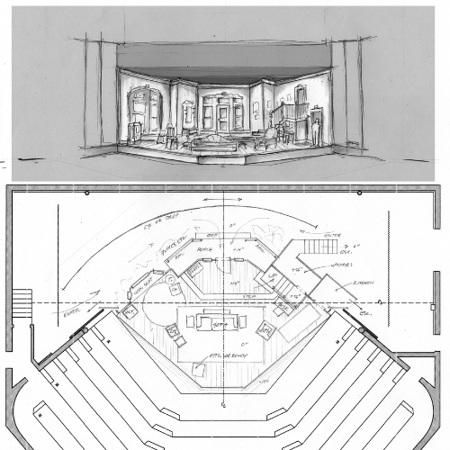
There are a lot of actors who have to inhabit this stage, so one of the things we have to figure out is how to make a space where we can have a lot of people on this stage and have it be composed in a way that works for Court Theatre’s space, but also for the audience, so they can understand what’s going on.
This is one of the very first sketches of trying to understand what the space can do–where are the places they need to go? The kitchen, the window, the front door?
I tried to elevate areas upstage so that sightlines across the stage won’t be blocked by other actors, and in order to accommodate sightlines, things need to open up and get wider.
Increasing the height often helps with width, but I didn’t want to increase the height so much that it looks like a grand ballroom; I have to keep the walls at a more human scale so it doesn’t feel like they’re in a mansion.
This is an important play, both when it was first presented and now. My intention for the scenic design, overall, is to accurately create the world that these characters inhabit, as well as provide staging options that will allow the storytelling and the actors’ work to be the main focus.
Costume Design
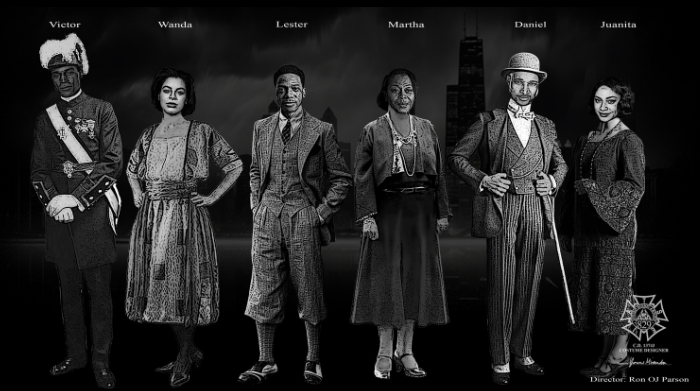
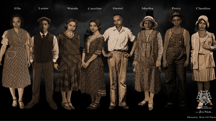
Yvonne: I just did a play with Ron at Chicago Shakespeare Theater, and I’m really excited to finally get to do a play here at Court. When Ron asked me to do this show, and I originally read it over, I realized that I’d grossly underestimated the number of costumes this show would require. And I’ve done a show where I’ve costumed 100 people!
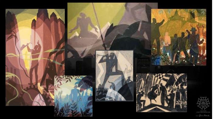
Ron sent some artwork as inspiration for the color palette – I believe it was Aaron Douglas – and Ron also explained that he was inspired by movies from back in the day. Not Technicolor, but movies where the color is muted, and things are pushed forward or back through color.
Here are some of the pieces he sent, along with pieces that I researched and used as inspiration.
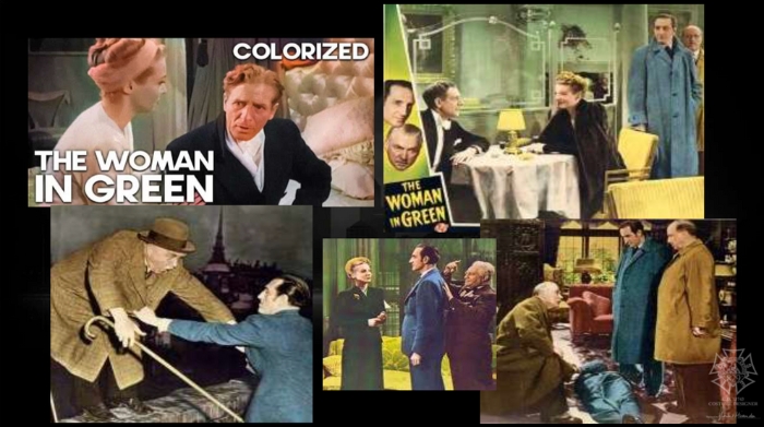
And these are the movies – here, specifically, he was talking about The Woman in Green.
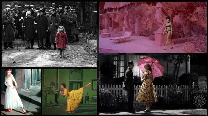
I was thinking about this type of design and how they’d bring things into focus, and the thing that came to mind was Schindler’s List. The whole movie is in black and white, except for the one image of the little girl in the red coat. I thought that was a very interesting way to highlight the heartbreak, and the tragedy, and the fact that not even a child was excused from the Holocaust. I wanted to utilize color similarly, especially at the end of the play during the climax, so we talked about how to do that, and we decided to use sepia.
Before we even discussed costumes , I was thinking about how we can get this Dorothy effect from The Wizard of Oz—where it starts in grayscale , and then she opens the door, and we get the color of Oz. We started with a more muted color palette, and as we progress through the show, more sepia tones come in, and it subtly progresses until the end, when all of Act III is in sepia.
Based on the images Ron sent me, I picked a color palette that would allow us to go into muted colors but not blend in with the set. Mixing those colors with what I mentioned earlier—about Schindler’s List and the coat—this means that during the climax, when there’s a shooting, we are going to see that. The red blood will be the thing that stands out the most against the sepia.
This is a design that, I hope, will demonstrate the gravity of the tragic themes of the play.